
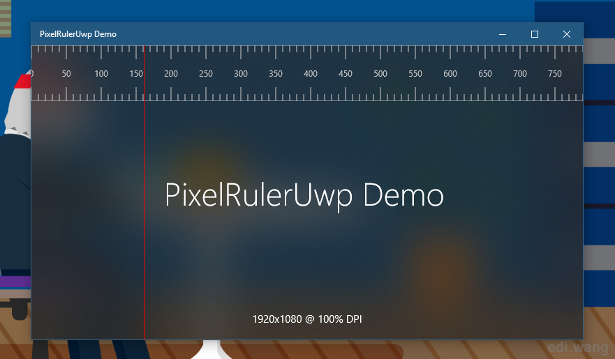
In certain applications, we may need an on-screen ruler that indicates pixels on the screen. However, the only built-in ruler in UWP is within the InkToolbar control, we are not able to use it elsewhere. So, I will teach you how to build a pixel ruler which can be used anywhere in your UWP applications.
The Demo App
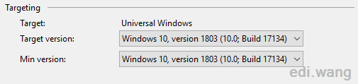
Create a new blank UWP application called PixelRulerUwp with minimal runtime version as Windows 10, version 1803 (10.0; Build 17134)
Win2D
Official document describes Win2D as: Win2D is an easy-to-use Windows Runtime API for immediate mode 2D graphics rendering with GPU acceleration. It is available to C#, C++ and VB developers writing apps for the Windows Universal Platform (UWP). It utilizes the power of Direct2D, and integrates seamlessly with XAML and CoreWindow.
We will use Win2D to draw the ruler. To add Win2D to our application, install it from NuGet:
Install-Package Win2D.uwpCreate PixelRuler User Control
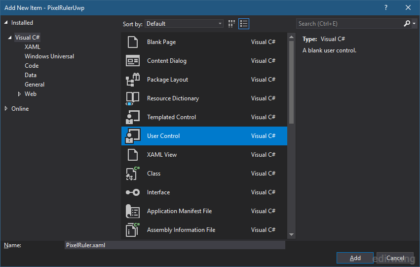
Add a new user control called “PixelRuler.xaml” into your application.
The Win2D can draw things on a CanvasControl, so we need to add a CanvasControl named “RulerCanvas” which we are going to draw the ruler UI onto it.
This will need a new namespace to be added into UserControl attributes.
xmlns:xaml="using:Microsoft.Graphics.Canvas.UI.Xaml"and then add the CanvasControl
<xaml:CanvasControl x:Name="RulerCanvas"
                    VerticalAlignment="Top" />
This is not the final XAML code, we will also complete it later.
Create Binding Properties
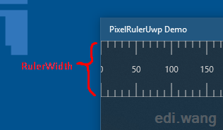
The ruler needs at least a width and a background color. So, we need to add them into the code behind PixelRuler.xaml.cs
By implementing the INotifyPropertyChanged interface, we can enable bindings.
using System.ComponentModel;and then:
public sealed partial class PixelRuler : UserControl, INotifyPropertyChangedand implement it:
public event PropertyChangedEventHandler PropertyChanged;

[NotifyPropertyChangedInvocator]
private void OnPropertyChanged([CallerMemberName] string propertyName = null)
{
    PropertyChanged?.Invoke(this, new PropertyChangedEventArgs(propertyName));
}
Then, create the RulerWidth property:
public static readonly DependencyProperty RulerWidthProperty = DependencyProperty.Register(
    nameof(RulerWidth),
    typeof(int),
    typeof(PixelRuler),
    new PropertyMetadata(null)
);

public int RulerWidth
{
    get => (int)GetValue(RulerWidthProperty);
    set => SetValue(RulerWidthProperty, value);
}
The DependencyProperty type is usually used in UserControl so that the user can set values to it when using your UserControl.
Similarly, add the BackgroundColor property:
Include namespace
using Windows.UI;And add:
public static readonly DependencyProperty BackgroundColorProperty = DependencyProperty.Register(
    nameof(BackgroundColor),
    typeof(Color),
    typeof(PixelRuler),
    new PropertyMetadata(null)
);

public Color BackgroundColor
{
    get => (Color)GetValue(BackgroundColorProperty);
    set { SetValue(BackgroundColorProperty, value); OnPropertyChanged(); }
}
Give them default values in the constructor:
public PixelRuler()
{
    this.InitializeComponent();
    RulerWidth = 50;
    BackgroundColor = Color.FromArgb(128, 238, 238, 238);
}
Now modify the PixelRuler.xaml and bind these properties.
<xaml:CanvasControl x:Name="RulerCanvas"
                    Height="{x:Bind RulerWidth, Mode=OneWay}"
                    ClearColor="{x:Bind BackgroundColor, Mode=OneWay}"
                    VerticalAlignment="Top" />
Add the PixelRuler UserControl into your MainPage.xaml:
<local:PixelRuler HorizontalAlignment="Stretch"
                  VerticalAlignment="Top" />
Draw Ruler
To draw graphics onto the CanvasControl, use the “Draw” event, name the event handler as “RulerCanvas_OnDraw”.
<xaml:CanvasControl x:Name="RulerCanvas"
                    VerticalAlignment="Top"
                    Height="{x:Bind RulerWidth, Mode=OneWay}"
                    ClearColor="{x:Bind BackgroundColor, Mode=OneWay}"
                    Draw="RulerCanvas_OnDraw" />
For tutorial purpose, I will use hard coded values for now:
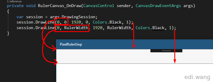
private void RulerCanvas_OnDraw(CanvasControl sender, CanvasDrawEventArgs args)
{
    var session = args.DrawingSession;
    session.DrawLine(0, 0, 1920, 0, Colors.Black, 1);
    session.DrawLine(0, RulerWidth, 1920, RulerWidth, Colors.Black, 1);
}
As the API signature:
public void DrawLine(float x0, float y0, float x1, float y1, Color color, float strokeWidth);Here, 1920 means your screen width, (x0, y0) is the start point for the line, (x1, y1) is the end point, 0 is the top left corner of the App screen.
Run the project, you will get an empty ruler with a top line and a bottom line.
Now you understand the basic concept of how to use Win2D to draw things on a CanvasControl and use it in an application page. Let’s dig in to more details to complete the ruler.
Draw Steps
A ruler has large steps and small steps, we can allow user to customize them.
To represent those two things, add two properties:
public static readonly DependencyProperty LargeStepsProperty = DependencyProperty.Register(
    nameof(LargeSteps),
    typeof(int),
    typeof(PixelRuler),
    new PropertyMetadata(null)
);

public int LargeSteps
{
    get => (int)GetValue(LargeStepsProperty);
    set => SetValue(LargeStepsProperty, value);
}

public static readonly DependencyProperty SmallStepsProperty = DependencyProperty.Register(
    nameof(SmallSteps),
    typeof(int),
    typeof(PixelRuler),
    new PropertyMetadata(null)
);

public int SmallSteps
{
    get => (int)GetValue(SmallStepsProperty);
    set => SetValue(SmallStepsProperty, value);
}
Also add default values for them in the constructor:
public PixelRuler()
{
    // …
    LargeSteps = 50;
    SmallSteps = 10;
}
For tutorial purpose, I also use hard code here, now the RulerCanvas_OnDraw event handler is:
private void RulerCanvas_OnDraw(CanvasControl sender, CanvasDrawEventArgs args)
{
var session = args.DrawingSession;
session.DrawLine(0, 0, 1920, 0, Colors.Black, 1);
session.DrawLine(0, RulerWidth, 1920, RulerWidth, Colors.Black, 1);
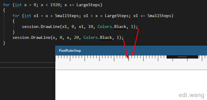
for (int x = 0; x < 1920; x += LargeSteps)
{
for (int x1 = x + SmallSteps; x1 < x + LargeSteps; x1 += SmallSteps)
{
session.DrawLine(x1, 0, x1, 10, Colors.Black, 1);
}
session.DrawLine(x, 0, x, 20, Colors.Black, 1);
}
}
Here, 10 means small step mark length, 20 means large step mark length.
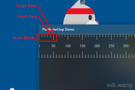
Run the project, you will get a ruler with large and small steps.
Draw Text
A ruler needs text on large step. Add this code to RulerCanvas_OnDraw event handler.
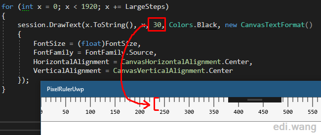
for (int x = 0; x < 1920; x += LargeSteps)
{
    session.DrawText(x.ToString(), x, 30, Colors.Black, new CanvasTextFormat()
    {
        FontSize = (float)FontSize,
        FontFamily = FontFamily.Source,
        HorizontalAlignment = CanvasHorizontalAlignment.Center,
        VerticalAlignment = CanvasVerticalAlignment.Center
    });
}
Here, 30 means the margin from ruler top to the text, it equals the large step mark length added by 10px.
The FontSize and FontFamily don’t need to add another two properties, they are inherited from UserControl type itself, which makes them already can be controlled by the user, e.g. from MainPage.xaml:
<local:PixelRuler HorizontalAlignment="Stretch"
                   VerticalAlignment="Top" FontSize="12" FontFamily="Consolas" />
Run the project, you will get a ruler with steps and text:
Now you have a ruler with a basic functionality. Let’s make it more awesome.
More Complete Functions
Our UserControl need to be used in different scenarios and allow user to customize based on their needs. So, we can’t use hard coded values. Let’s make it more flexible to use.
For example, about the screen width, I hard coded it to 1920. Let’s set it to the large side of the user’s device screen resolution. To get the screen resolution, you can install my UWP helper library:
Install-Package Edi.UWP.HelpersNow you can change every “1920” to largePixel like this:
var pixelW = Edi.UWP.Helpers.UI.GetScreenWidth();
var pixelH = Edi.UWP.Helpers.UI.GetScreenHeight();
var largePixel = pixelW > pixelH ? pixelW : pixelH;

session.DrawLine(0, 0, (int)largePixel, 0, Colors.Black, 1);
session.DrawLine(0, RulerWidth, (int)largePixel, RulerWidth, Colors.Black, 1);
I’ve also added these properties for customization:
- DrawBorder
- ScaleMarkPosition
- ScaleMarkLength
- ScaleMarkColor
- TextColor
- TextMargin
You can have deep control of the ruler:
<local:PixelRuler HorizontalAlignment="Stretch"
                  VerticalAlignment="Top"
                  RulerWidth="80"
                  LargeSteps="50"
                  SmallSteps="10"
                  ScaleMarkLength="20"
                  FontSize="12"
                  ScaleMarkPosition="Both"
                  ScaleMarkColor="#CCC"
                  TextColor="#CCC"
                  FontFamily="Segoe UI"
                  TextMargin="10"
                  BackgroundColor="#333"
                  DrawBorder="True"
                  Height="80" />
A complete code sample is on my GitHub: https://github.com/EdiWang/PixelRulerUwp
You can also check the demo App on Microsoft Store: https://www.microsoft.com/en-us/p/pixelruleruwp-demo/9nblggh5fjhn
Pete
Hi, thank you for the nice post!
Can you please make the code at https://github.com/EdiWang/PixelRulerUwp available again?