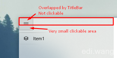
In UWP Apps, we some times extend our main view into title bar to get rid of Windows 10 default title bar. However if you are using NavigationView under extended title bar, you will find your PaneToggleButton overlapped by the title bar. And the user won't be able to click on the upper part of the button because it is where the title bar need to respond to window drag actions.
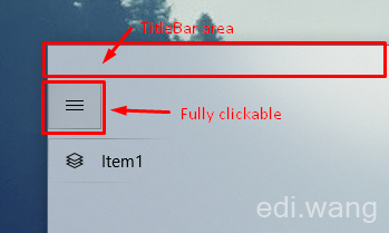
This image shows the common problem in this scenario. The problem also exists even in Microsoft's official "XAML Control Gallery" App for it's back button. Let's see how can we fix it by a workaround.
First, the code I used to hide the Windows default title bar is very common as Microsoft official sample:
//draw into the title bar
CoreApplication.GetCurrentView().TitleBar.ExtendViewIntoTitleBar = true;

//remove the solid-colored backgrounds behind the caption controls and system back button
var viewTitleBar = ApplicationView.GetForCurrentView().TitleBar;
viewTitleBar.ButtonBackgroundColor = Colors.Transparent;
viewTitleBar.ButtonInactiveBackgroundColor = Colors.Transparent;
viewTitleBar.ButtonForegroundColor = (Color)Resources["SystemBaseHighColor"];
And my App does not need a back button, so I hided it in NavigationView:
<NavigationView IsBackEnabled="False" IsBackButtonVisible="Collapsed">
<NavigationView.MenuItems>
<NavigationViewItem Content="Item1">
<NavigationViewItem.Icon>
<FontIcon Glyph=""/>
</NavigationViewItem.Icon>
</NavigationViewItem>
</NavigationView.MenuItems>
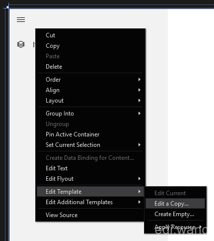
</NavigationView>Now we need to customize the style of the PaneToggleButton. You can get a copy of the style and template of any built-in UWP controls by right click on the Blend for Visual Studio designer and choose Edit Template, Edit a Copy and name it ExtTitleBarNavigationViewStyle
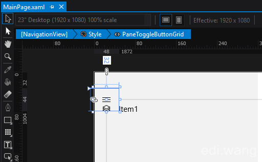
Find PaneToggleButtonGrid and change the Margin value to 0,32,0,8, which 32 is the height of Windows 10 title bar.
<Grid x:Name="PaneToggleButtonGrid" HorizontalAlignment="Left" Margin="0,32,0,8" VerticalAlignment="Top" Canvas.ZIndex="100">Now the hamburger button is moved to lower space, however it will overlap the SplitView pane.
So we have to do another change. Find PaneContentGrid and add a margin of 0,32,0,0.
<Grid x:Name="PaneContentGrid" Margin="0,32,0,0">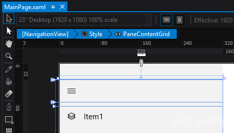
You will get a space with the height of the title bar above the PaneToggleButton now, which makes the button fully clickable!
walterlv
I'm suffering from this issue these days, too. But I tried another solution. https://walterlv.github.io/post/tips-for-customize-uwp-title-bar.html